
Obama | Header
Something Hopeful
The Obama Logo
SCROLL DOWN
Obama | Header
Something Hopeful
The Obama Logo
Obama | Intro
Obama | Intro
Obama | Historical Reference
Obama | Historical Reference

“What is unique here…is (Axelrod’s) desire to transcend the conventions of traditional campaign design (i.e. white type on a blue ground with some vapid interpretation of the American flag...see logos from last Bush and Kerry campaigns).”
“I was looking for something that would transcend the usual political iconography and would speak to a movement for change, not just a campaign for office.”
“As a starting point, I showed them the blue Harold Washington button from 1983 with the white lines that hinted at a sunrise. ‘I want something with a feel like this,’ I told Colin and his team. ‘Something hopeful. Something that speaks to a new beginning.’ ”

Campaign Button for Harold Washington, 1983

Mode Project creative brief, December, 2006
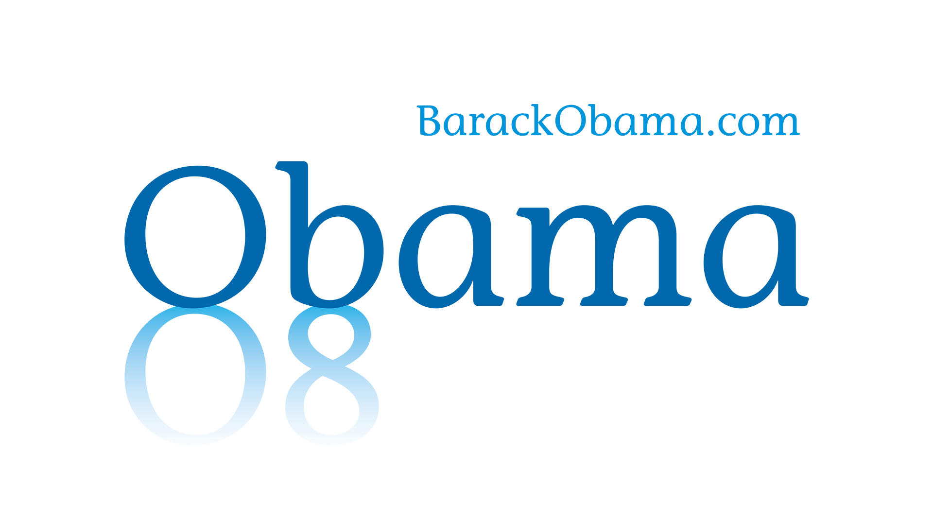
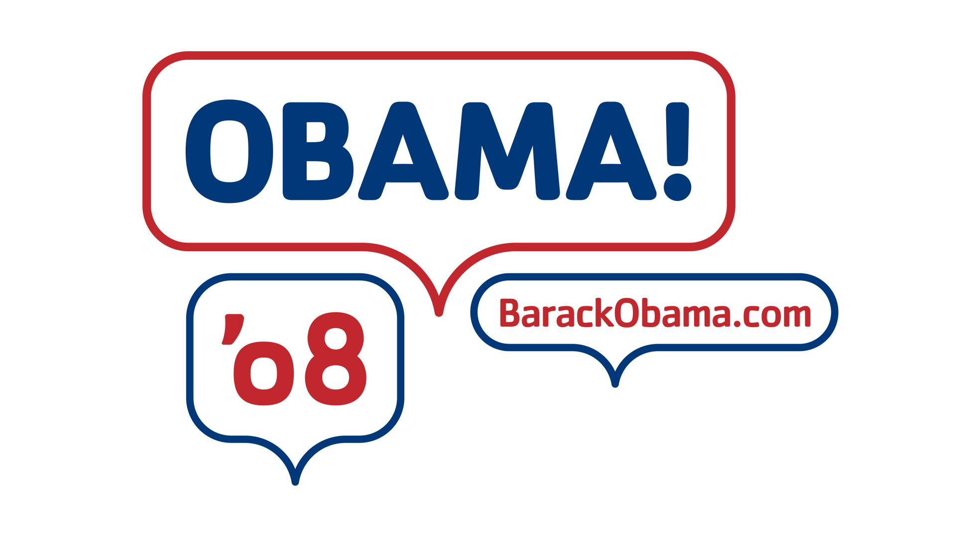
Obama | Logo Concepts
Obama | Logo Concepts


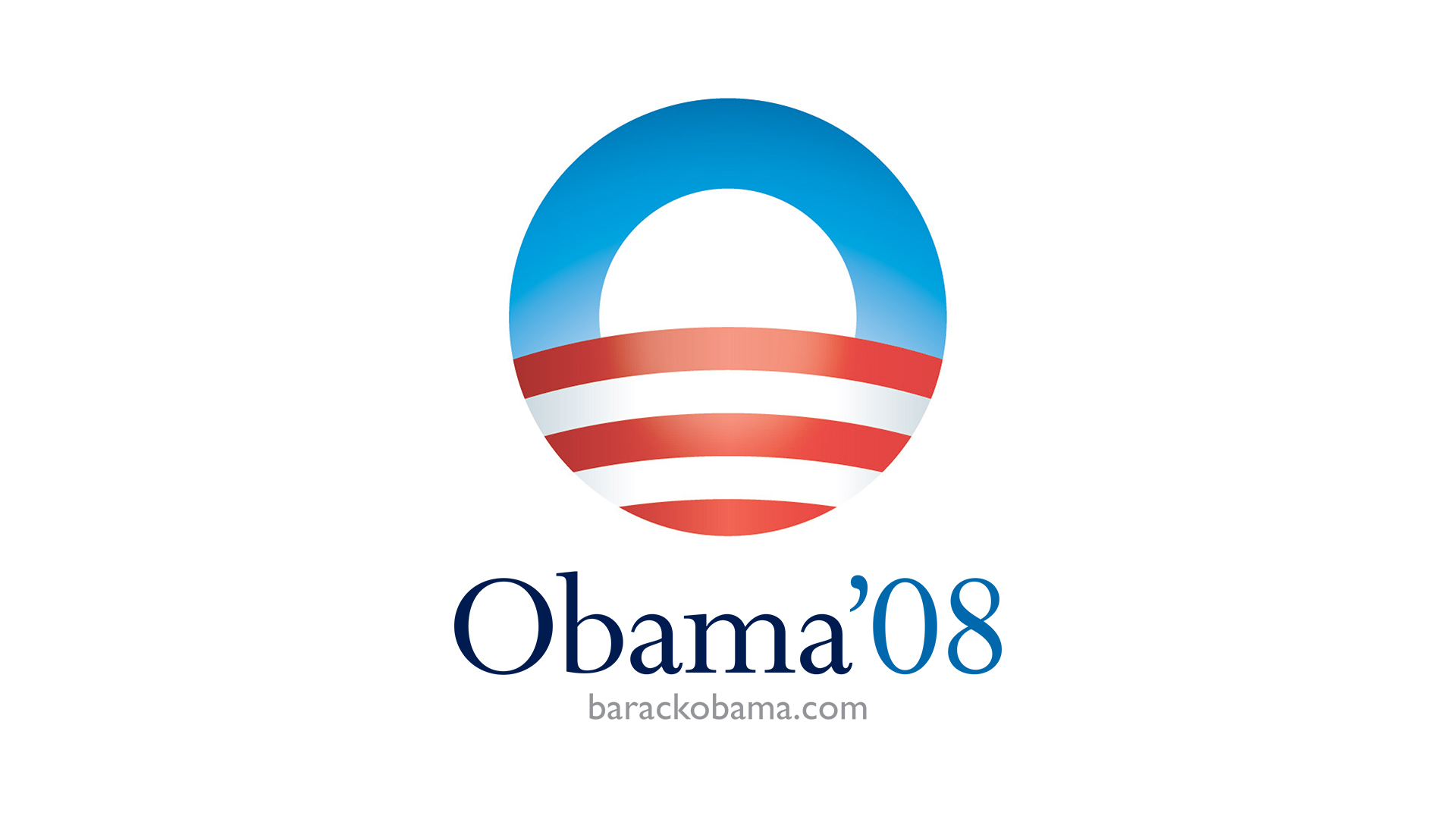


“It was exactly what I had hoped. Even though it employed traditional colors, it didn’t look like a political insignia. Without Obama’s name or a word of copy, the image conveyed so much.”
Obama | Final Logo
Obama | Final Logo


Excerpt from the Obama '08 Identity Guidelines
Obama | Credits
Obama | Credits
AKPD Message and Media
David Axelrod
Mode Project
Creative Directors: Colin Carter, Steve Juras, Brooks Ruyle
Sender LLC
Principal / Project Manager: Sol Sender
Designers: Amanda Gentry, Andy Keene